EPAPA is an AI powered math learning app designed for school students, with math learning challenges.
The main focus is on innovation, using AI to make math and science learning engaging. The learning content is in the form of videos, worksheets, and scripts to make maths learning easy, interesting and accessible.
My Role
As a sole Product Designer, my main objective was to create intuitive user interfaces that makes the learning journey smooth and provide clarity for the target group on how to interact with the app effectively.
✨ Designing Intuitive AI Experience
I have designed AI feature to make learning more interactive and accessible for students. I used strategy of conversational approach to help students get instant, personalized answers while staying connected to their learning journey
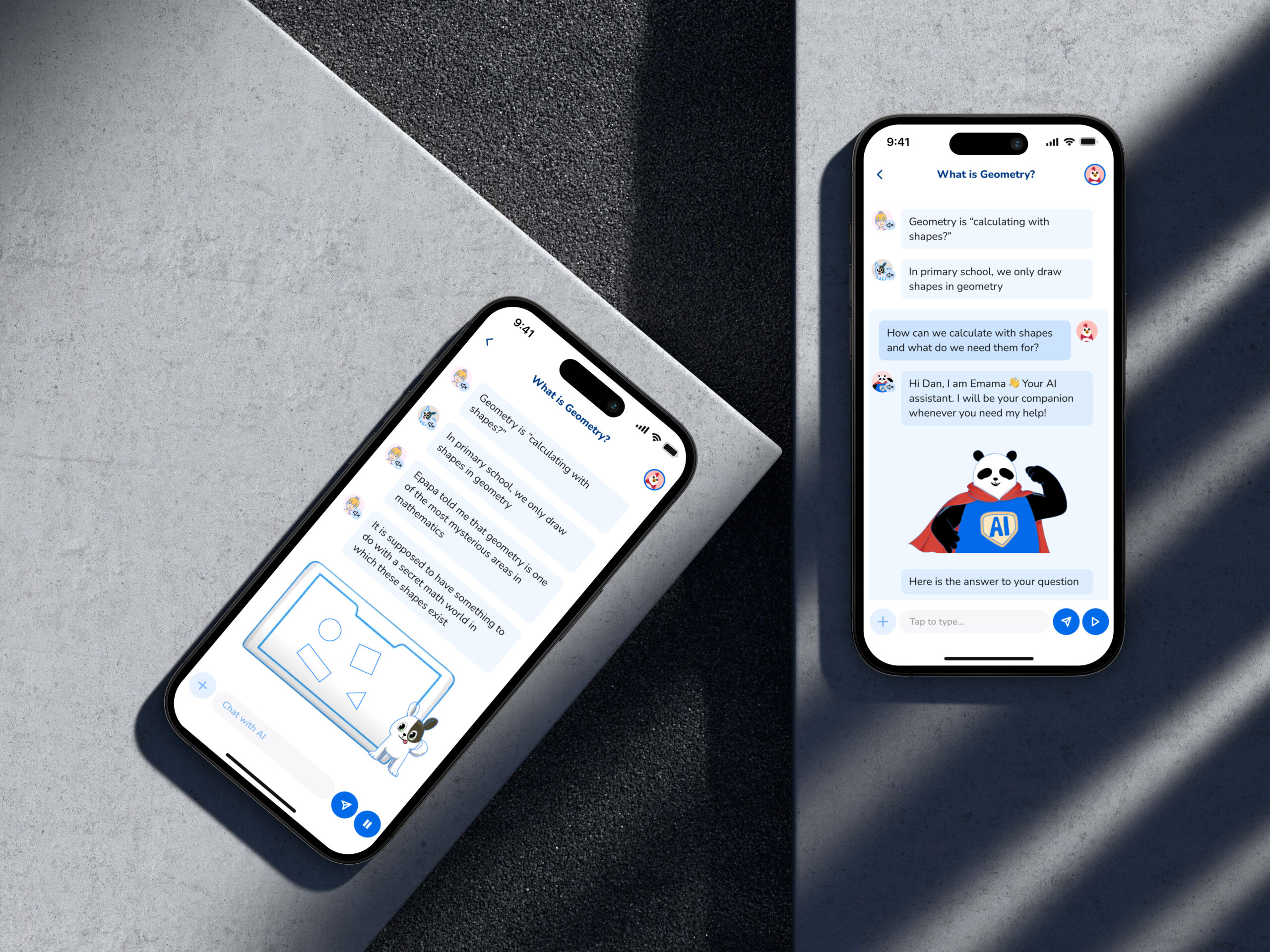
AI Chat Interaction Flow
The AI greets you on your first use, then answers questions directly in a neatly grouped chat with a fun background change.
After each answer, it checks if your question was resolved, guiding you to continue learning or ask again. You can minimize the chat to a single line view, and give feedback with a thumbs up or thumbs down, making learning simple and engaging.
🐼 Epapa Subscription models
I redesigned and updated the subscription model’s user flow to make it easier for users to understand the differences between each plan.
By simplifying the layout and clearly highlighting the unique features of each model, users can now make informed decisions with greater ease.
Clear and Transparent Subscription Management
Subscription plans now clearly displayed all included features, making it easy to compare options and see the benefits. The design also recommends upgrading to a higher plan, highlighting added value.
After purchase or upgrade, users can easily view their plan details, benefits, renewal date, and a clearly visible cancel option, ensuring transparency and convenience.
🏡 Epapa Home screen
The home screen was redesigned to address the lack of a bottom navigation bar, which made key features hard to find.
The new design is more welcoming and interactive, greeting users after their first visit and making it easier to explore topics and access key features, resulting in simpler, more engaging navigation.
Streamlined Information Architecture with Design Consistency
The home screen redesign included reorganizing the information architecture to make content and features easier to navigate, while retaining the existing design system for consistency. This ensured a logical layout that improved usability without altering the app’s original look and feel.
🤖 AI Chat Screens
I designed the EPAPA AI chat interface to offer a ChatGPT-like experience, enabling users to ask questions, get answers, and resolve doubts directly within the app, eliminating the need to switch to external platforms.
Seamless and Intuitive Chat Experience
The AI chat interface lets users view past conversations and access their chat history, ensuring easy reference to previous queries. The design focuses on delivering a smooth, intuitive, and engaging experience.
🧸 Developing Character Onboarding
The app uses animated characters to make math feel like a fun cartoon. However, these characters weren’t introduced early enough, so I designed a “Character Onboarding” flow to showcase them right at the start.
Enhancing Engagement Through Early Character Introduction
By introducing animated characters during onboarding, the app immediately captured the students attention and created a stronger connection from the beginning.
This early engagement not only made learning more enjoyable but also encouraged students to stay motivated and invested in their math journey