EPAPA is an EdTech company, focusing on students with math learning challenges.
The main focus is on innovation, using AI to make math and science learning engaging. The learning content is in the form of videos, worksheets, and scripts to make maths learning easy, interesting and accessible.
About the Project
EPAPA is an AI math learning app designed for school students to improve their math skills through a fun and engaging experience.
My Role
As a sole Product Designer, my main objective was to make math learning feel less intimidating by framing math as a fun experience, motivating exploration, and provide clarity on how to interact with the app effectively.
Designing Intuitive AI Experience
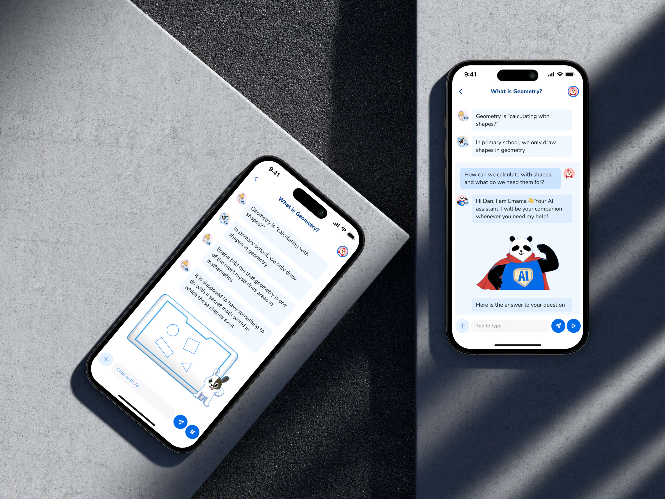
Introducing AI Interaction
I have designed AI feature to make learning more interactive and accessible for students. I used strategy of conversational approach to help students get instant, personalized answers while staying connected to their learning journey
How the AI Screen flow works
When you use the AI for the first time, it says hello and answers your question. After that, it skips the hello and answers your questions right away. Your chat with the AI is grouped neatly so it’s easy to follow, and the background changes when you send a question to make it more fun.
After answering, the AI asks, “Did this answer your question?” If you say “Yes,” it tells you to tap the play button to go back to learning. If you say “No,” it asks you to type another question. The chat keeps going until your questions are answered.
When you’re done, you can minimize the chat, which shrinks into a single line showing your last question. At the end, you can also give feedback by tapping a thumbs-up or thumbs-down to let us know how helpful it was!
This makes learning with the AI fun, simple, and easy to use.
Epapa Subscription models
Updating the Subscription Flow and Screens
I redesigned and updated the subscription model’s user flow to make it easier for users to understand the differences between each plan. By simplifying the layout and clearly highlighting the unique features of each model, users can now make informed decisions with greater ease.
Subscription plans
When users pick a subscription plan to view, they can now easily see all the details about what’s included, making it simple to understand the benefits of each plan. To help users get the best experience, the design also suggests upgrading to the next higher plan, showing why it’s a better option. This way, users are guided toward choosing a plan that offers more features and value.
Paid Users
After a user buys or upgrades to a new plan, they can easily see all the details and benefits of their plan. We’ve made it easy for users to cancel their plan by showing the cancel option clearly, so it’s not hard to find. Users can also see when their next renewal date is, so they always know when the plan will renew.
Epapa Home screen
Redesigning and streamlining the Home Screen
Redesigning the home screen was crucial because the previous design lacked a bottom navigation bar, making key features hard to discover. I identified this problem and saw an opportunity to improve it by creating a more welcoming and interactive home screen. The new design provides a positive and engaging experience, greeting users warmly after their first interaction. It also helps users easily find the topics they can access and explore the key features of the product, making navigation simpler and more enjoyable.
Old vs New Home Screen
By redesigning the home screen, I also focused on re-arranging the information architecture to ensure content and features were logically organized, making it easier for users to navigate and explore. While doing this, I maintained and used the styles from the existing design system, ensuring consistency with the app’s original look and feel without making major changes to the visual design.
AI Chat Screens
Designing AI Chat Interface
I designed the AI chat interface for EPAPA with the goal of providing users an experience similar to ChatGPT. This allows users to interact with AI solutions, ask direct questions, and clear their doubts within the app itself, without needing to leave for Google or ChatGPT.
AI Chat Screens
Users can also view their previous conversations and access their chat history, making it easy to revisit past queries. The main design objective was to make the experience smooth, intuitive, and engaging.
Developing Character Onboarding
Epapa Onboarding
The app’s unique feature is its use of animated characters, making math feel like a cartoon while teaching concepts in a conversational way.
When I joined, I noticed these characters were not introduced early in the user journey and were less discoverable.
To address this, I designed a “Character Onboarding” flow to introduce the characters during user onboarding.
Introducing characters during onboarding enhances the student experience by immediately engaging them and creating a connection.
Which tools did you use to create this project?
Figma was mainly used to create the wireframes and prototypes. Miro board was used to ideate, and brainstorm design ideas.