How daily exploration sparked Daniel Lepiks' new project 'Onshore'.
Client
Female Health company inne, based in Berlin
Expertise
Female Health company inne, based in Berlin
Category
About the project
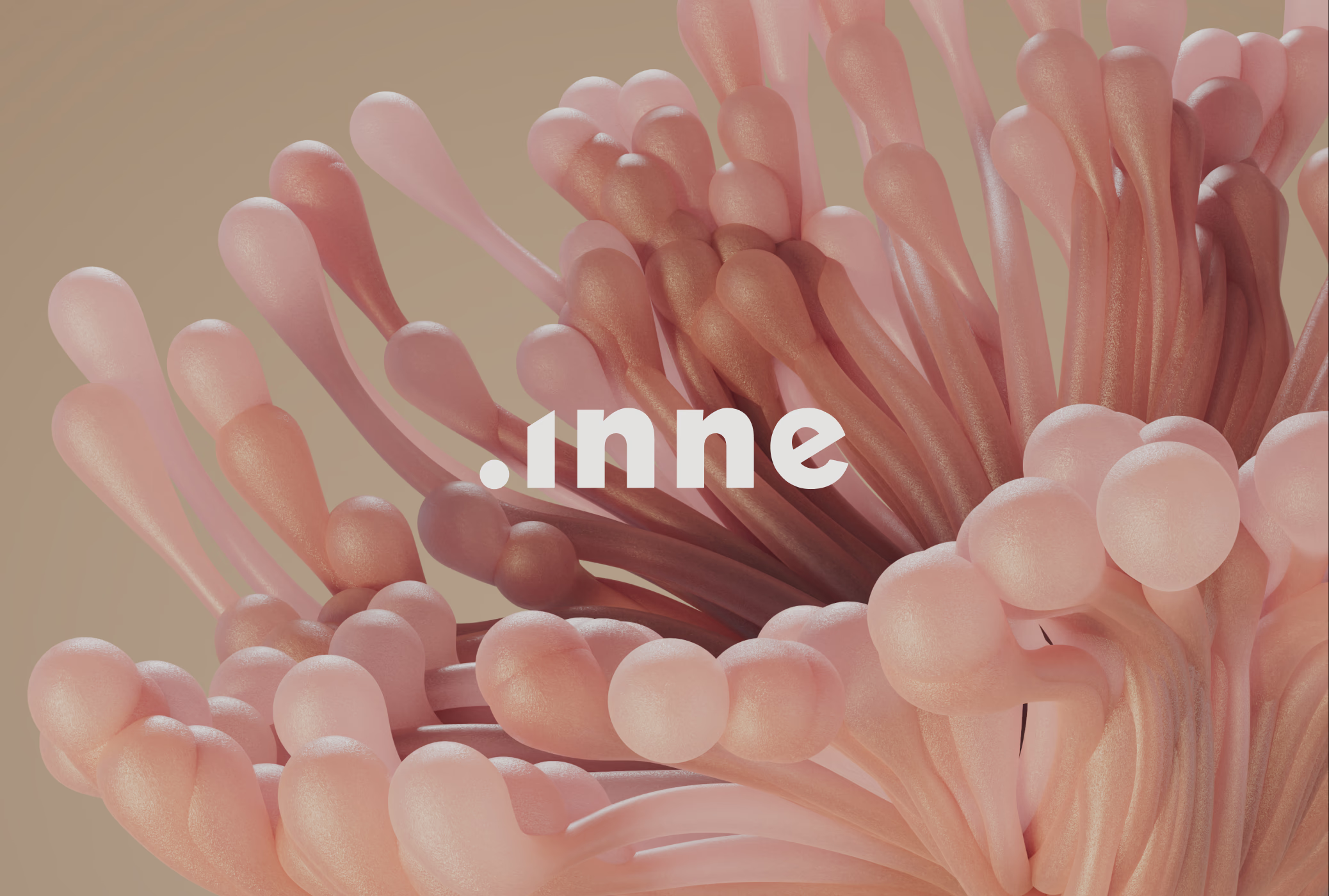
Inne has developed the world’s first at-home fertility monitoring system, designed to measure progesterone levels in saliva. Female health is under represented and under researched – by using the power of hormonal science, inne is leading a new era of enriched understanding. We helped inne evolve from being a product-led brand to one led by their purpose to guide woman across different life stages. To reflect this shift, we crafted a visual identity system based on the core idea “connect with your inner rhythm” that balances scientific accuracy, bold simplicity and human warmth. The resulting system is comprised of a strategic brand platform, an extensive 3D world, custom photography and documentation in the form of detailed brand manual.

What sparked this project?
Companies usually approach us to evolve their existing brand identities into cohesive systems. This mostly happens at a point of company growth or expansion into new markets / products. The challenge is to leverage some of the existing brand equity that was build but systemise and expand upon it to make it more flexible and give teams a set of tools to express the brand consistently. This was also the case for inne, who had already build a great foundation for their brand but had issues setting themselves apart from industry competitors and prepare the company for scale. Their approach to brand building was strongly led by their product but missed the articulation of a core idea that could express their true values and ambitions.
Do you have some project metrics to share?
Companies usually approach us to evolve their existing brand identities into cohesive systems. This mostly happens at a point of company growth or expansion into new markets / products. The challenge is to leverage some of the existing brand equity that was build but systemise and expand upon it to make it more flexible and give teams a set of tools to express the brand consistently. This was also the case for inne, who had already build a great foundation for their brand but had issues setting themselves apart from industry competitors and prepare the company for scale. Their approach to brand building was strongly led by their product but missed the articulation of a core idea that could express their true values and ambitions.

What is your approach to working on a project like this? Do you follow a specific process or framework?
Our approach to branding is a journey through three distinctive phases: Discover, Define, and Create. Every project has its own nuances, requiring adaptability based on timelines and specific deliverables. During the Discover phase, our primary aim is to fully understand the client. This involves a series of interviews, surveys, a deep dive into their documents, and a close look at their brand legacy. Once we’ve collected enough information, we initiate an audit of the existing brand, examining it from strategic, creative, and messaging perspectives. This deep dive helps us to determine what elements are working and which might need reconsideration.
The culmination of this exploration is what we term the “Future brand brief.” This document is multifaceted. It includes questions or challenges we believe the evolving brand should address, forming the bedrock of our strategic approach. Additionally, it offers a thorough competitor analysis and suggests early positioning opportunities for the brand.
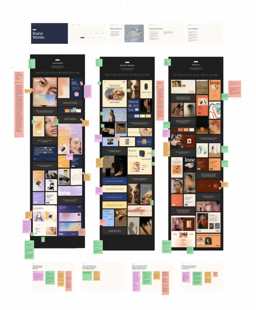
As we segue into the Define phase, strategy takes center stage. We start crafting a brand platform that encompasses the brand’s values, position, purpose, and personality, illustrating how these elements come together to represent a singular vision and goal for the company. Parallel to this, we embark on a visual exploration through what we lovingly refer to as “brand worlds.” These aren’t rigid brand concepts; instead, they’re a blend of initial explorations, mood boards, and potential ideas, granting us a glimpse into the possible universes a brand could inhabit. Once we identify the most fitting brand world, it serves as our foundation. From here, we construct a cohesive brand concept, guiding the client through the foundational idea, the identity’s components, and its various applications, ensuring every element is in harmony with our brand strategy.
The journey doesn’t end here. The Create phase marks the point where our ideas and strategies transition into tangible outcomes. After refining our direction, we bring onboard specialists – from photographers to illustrators – ensuring the brand identity truly comes alive. Concurrently, we tackle major brand touchpoints, with the website being a prime example. Here, emphasis is placed on structure, content, and design ethos. As we near completion, the brand finds its way onto a myriad of easy-to-use templates tailored for diverse platforms, from social media to presentations. Our final offering is a detailed brand guide, serving as both an inspirational and instructional resource, meticulously documenting every facet of the brand identity for future endeavors.

What did the early versions of this project look like? What did you learn from this v1?
We’ve explored many different directions for this brand early on. One of the later ones that stood out was based around the shape of a circle as a symbol for the female cycle, the circular notion of time and feeling of rhythm. We felt we really nailed this, it was super simple but could come to life in interesting ways through the layout and different circle treatments. After some reflection, inne’s founder voiced the feeling that this concept, while beautiful had one flaw: the circle represents perfection and inne is not about that, it’s about the imperfections and unique connections woman often have with their fertility. The circle represented a kind of “sameness” that felt wrong. This feedback directly sparked the idea behind our final concept of “connect with your inner rhythm” which uses imperfect textures and repetition as a leading motive that is expressed through 3D landscapes.
'We wanted to create a brand that feels approachable, supportive and warm but also scientific, innovative and a little bit abstract, allowing a wide range of women to identify themselves with the brand on a deeper level.'
What was your biggest learning or take-away from creating this project?
In times of design subscription services and one week brand sprints, it’s easy to doubt yourself during a 10 month project but it’s important to remind ourselves that good branding takes time. Timelines are often something clients push back on – not so in the case of inne. Their team fully understood that you can’t create work of this scope in a rushed manner because it’s an investment in the future – we’re grateful for that. Time and space for exploration, discussion and refinement are an important part of the process, they allow brands to become more memorable, smarter and connect deeper with their audience.
What was the result of this project?
Superorganism’s launch was covered in Bloomberg, Forbes, and TechCrunch, all with really positive press coverage. And the brand was received really well within the design community. We heard lots of kind feedback, and it was particularly rewarding to see so much love for the logo that we worked so hard on. The launch happened just a few months ago, and we’ve already had multiple referrals from the project!
Which tools did you use to create this project?
12% of our design work happens Figma these days. Being able to collaborate easily with our clients is very important to us and by using the tools which are already established in an organisations, we keep things simple. During the kickoff and strategy phases of a project we frequently use Figjam to run remote workshops. When it comes to documenting and handing over the brand we lean on Figma to create design components, templates and an open brand manual that is easy to update.